← BrandingCANCER
Brand Identity · 02
CANCER
FOUNDATION.
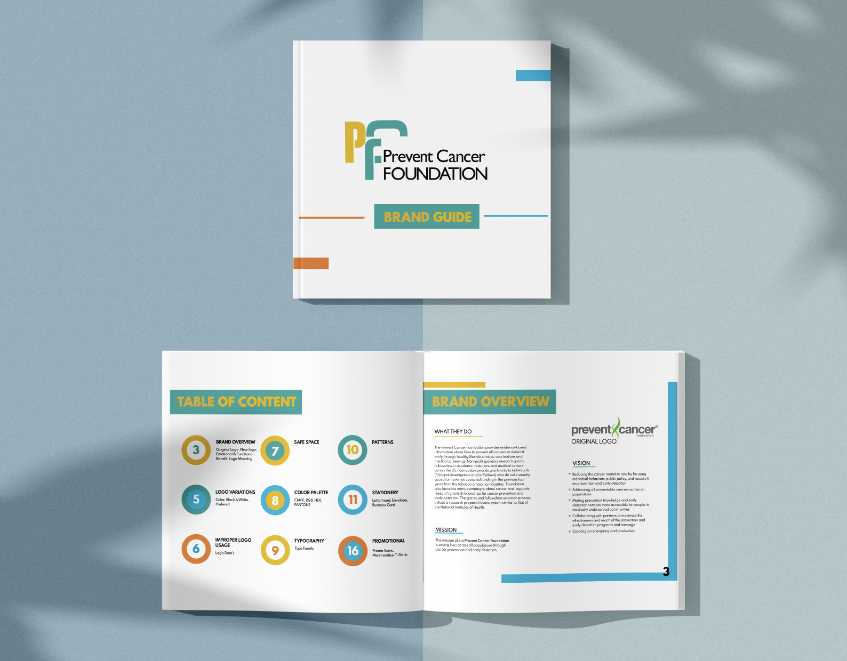
Prevent Cancer Foundation rebranding — refreshed logo, updated corporate colors, new typography, and complete stationery system.
About the Project
Purpose-Driven Rebrand
The campaign involved a refreshed company logo, updated corporate colors, and new typography — giving the foundation a modern presence that communicates hope, strength, and community support.
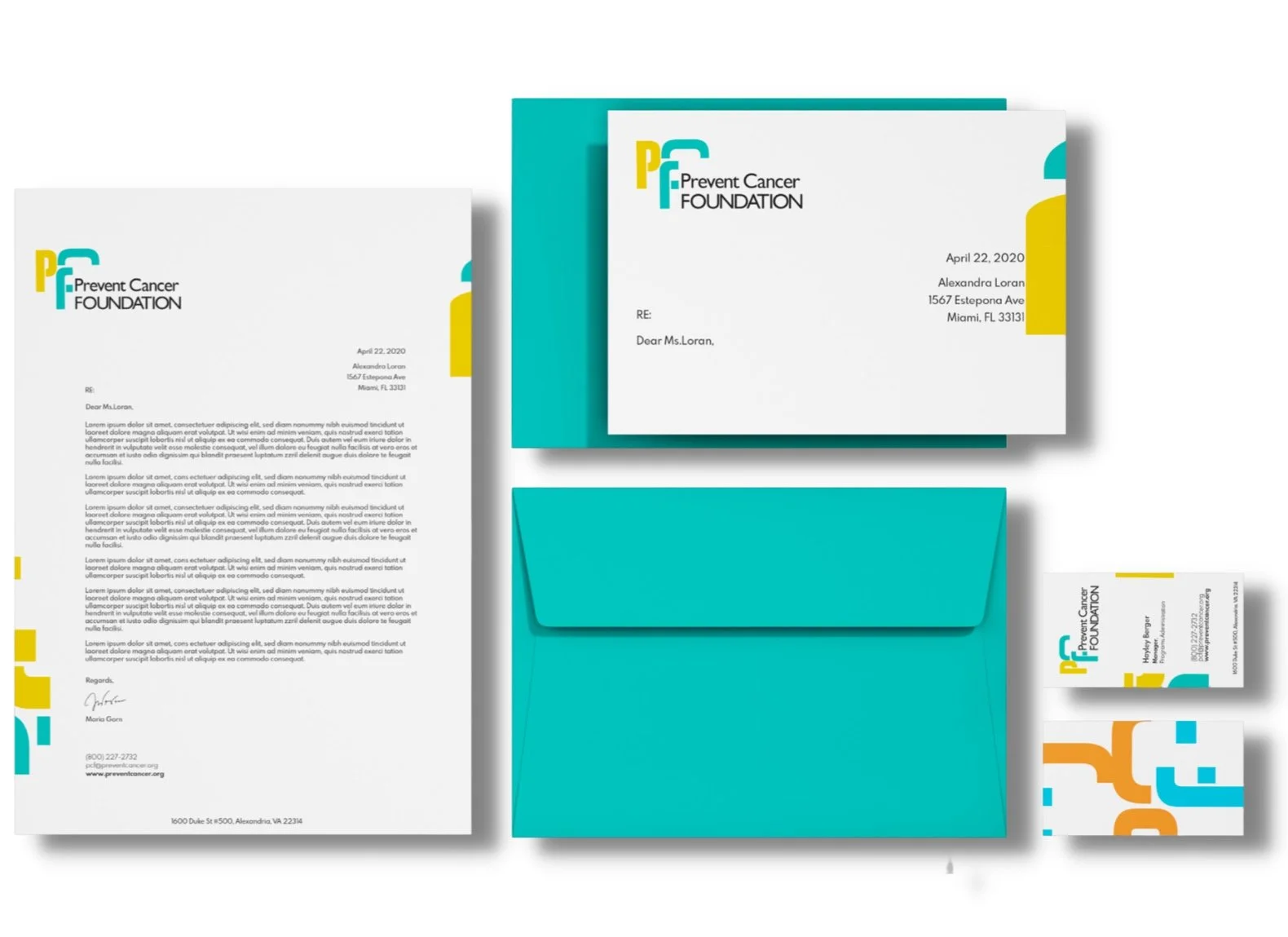
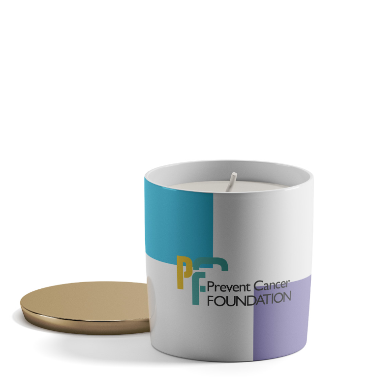
Every design element was crafted to balance the gravity of the mission with a message of optimism — creating collateral that inspires action and trust across business cards, merchandise, and promotional materials.
What We Delivered
Logo redesign
Corporate color system
Typography guidelines
Business cards & stationery
Merchandise design
Promotional materials
Color System
COLOR
PALETTE.

Purple

Blue

Orange

Yellow

Green
Campaign Work
THE
WORK.